

In retail, the human brain processes color significantly faster than it processes shape, text, or brand logic. When a customer walks past your toy boutique, they do not initially see a Pop Mart Labubu or a ShinWoo Ghost Bear. They see a massive block of Rosa, a gradient of Pastel Blue, or a chaotic, stressful mess of clashing colors.
If you simply stock your wholesale deliveries from KidultsBox onto your shelves alphabetically or by release date, you are actively destroying your store’s conversion rate. Visual Merchandising (VMD) is not about neatness; it is about psychological manipulation. A visually chaotic shelf causes “Cognitive Overload,” prompting the customer to walk away without buying. A color-coded shelf triggers the “Candy Store Effect,” compelling them to buy multiple items to recreate that aesthetic harmony in their own homes.
This comprehensive B2B playbook will deconstruct the science of Color Blocking, the physics of Visual Gravity, and the exact merchandising architectures required to turn your blind box displays into irresistible, high-margin revenue engines.
1. The Neurochemistry of Color in Retail
Before moving a single box, you must understand what colors do to the adult buyer’s brain. You are not selling plastic; you are selling the emotion that the color of that plastic evokes.
| Color Palette | Neurological Response | Objetivo demográfico | KidultsBox IP Examples |
|---|---|---|---|
| Pastel Pink / Rose | Triggers oxytocin. Induces feelings of nurturing, softness, and “Cute Aggression.” Lowers price sensitivity. | Gen Z, “Soft Girl” Aesthetic, Bag Charm collectors. | Baby Three V3 Macaron, Cino Dreamland Circus. |
| Deep Purple / Black | Signals luxury, mystery, and the macabre. Triggers intrigue and exclusivity. | Alternative, Goth-Cute, High-Income Adult Collectors. | Penny’s Box Antediluvian, ShinWoo Love or Solitude. |
| Mint Green / Earth Tones | Lowers cortisol (stress). Promotes a feeling of organic wellness, calm, and “Zen.” | Office Workers, “Deskterior” decorators, Millennial professionals. | Serie Flor Kimmon, Rolife Nanci. |
| High-Contrast Neon | Triggers adrenaline and dopamine. Highly energetic, demands immediate attention. | Hypebeasts, Sneakerheads, Streetwear enthusiasts. | Pop Mart MEGA Space Molly, TNTSPACE Dora. |
2. The “Color Blocking” vs. “IP Blocking” Dilemma
The most common debate among toy retailers is: “Should I keep all Pop Mart toys together, or should I mix brands to group them by color?”
The KidultsBox Verdict: The Hybrid Aesthetic
If you strictly “IP Block” (e.g., putting a neon green Pop Mart series right next to a pastel pink Pop Mart series), your shelf will look messy, even if it is logically organized.
The Solution is Color Dominance: Organize your store into “Color Zones.” Create a “Pastel Wall” and an “Edgy/Dark Wall.” Within the Pastel Wall, you can place a pink Pop Mart series next to a pink Baby Three plush. The customer’s eye reads the harmony of the color first. This cross-merchandising actually increases Average Order Value (AOV) because a customer who loves pink will buy both brands, whereas they might have ignored the Baby Three plush if it was quarantined in a separate “Plush Only” section.
3. The “Rainbow Gradient” Strategy (Horizontal Flow)
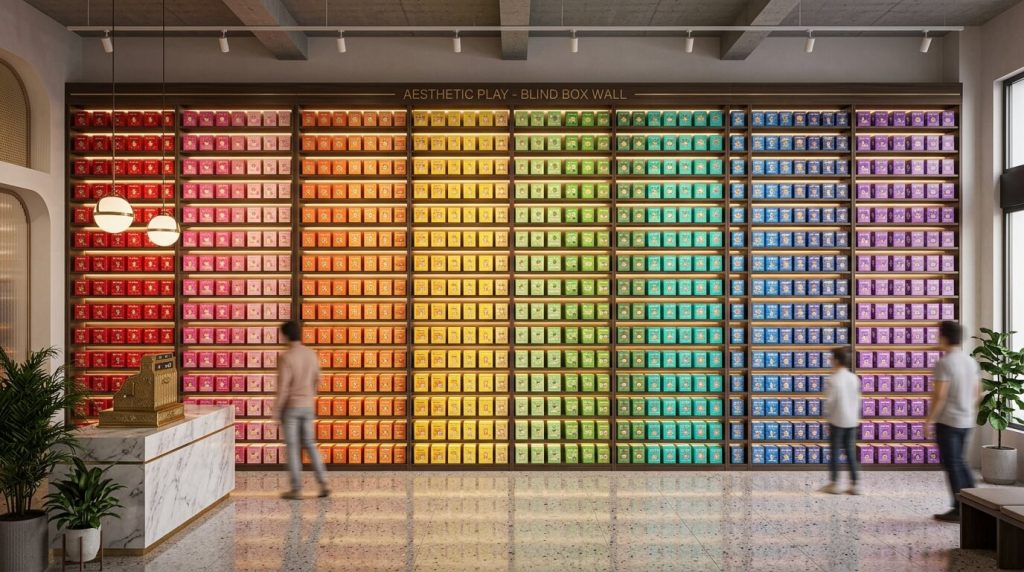
If you have a massive, continuous wall of blind boxes, the most visually arresting way to merchandise is the Gradient Flow. This replicates a spectrum or a rainbow.
La ejecución:
The human eye in Western markets reads from Left to Right. You must guide the eye smoothly across the spectrum.
- Far Left: Start with Warm, High-Energy colors (Reds, Oranges, Yellows). These act as the “Hook” to grab attention.
- Center: Transition into Greens and Blues (Cool, soothing colors). This is where customers will naturally pause and linger.
- Far Right: End with Purples, Blacks, and Whites.
This flow prevents visual whiplash. If you put a bright red box between two black boxes, it looks like a mistake. If it transitions smoothly from red to orange to yellow, it looks like a high-end art gallery.
4. Visual Gravity: The “Heavy Bottom” Rule
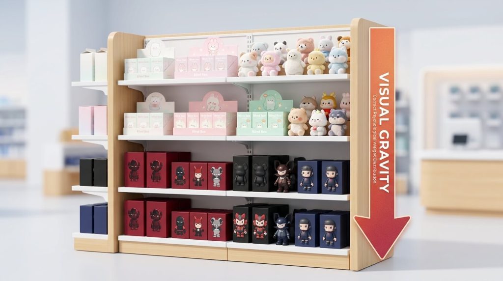
Colors have psychological weight. Dark colors (Black, Navy, Crimson) look “Heavy.” Light colors (White, Pastel Pink, Mint) look “Light.”
The Top-Heavy Trap:
If you place a series of dark, gothic ShinWoo Ghost Bears on the very top shelf, and a row of fluffy, white Kimmon plushies on the bottom shelf, your entire retail display will feel subconsciously unstable. It feels like the dark colors are going to crush the light colors. Customers will feel uneasy and won’t know why.
The Rule of Visual Gravity: Always place your darkest, highest-saturation packaging on the bottom shelves. Place your lightest, pastel, and white packaging on the top shelves at eye level. This grounds the display, making it feel solid, secure, and architecturally sound.
5. The “Camouflage” Technique: Liquidating Dead Stock
Color-coding is not just for aesthetics; it is a tactical weapon for inventory liquidation. What do you do when you order 3 master cartons of an obscure IP from KidultsBox, and it becomes “Dead Stock”?
Do not put it in a discount bin. Camouflage it.
Identify the dominant color of the dead stock packaging. Let’s say it is a muted blue. Take your absolute best-selling, highest-hype product that is also blue (e.g., a specific Pop Mart series). Place the highly desired blue boxes on the shelf, and intersperse the dead stock blue boxes directly beside and around them.
Because the colors match perfectly, the customer’s eye is drawn to the shelf by the hype product. Once they are standing there, the “Halo Effect” occurs. The high perceived value of the hype product bleeds onto the dead stock next to it. They look like a matching set. A customer will frequently buy the dead stock item simply because it matches the aesthetic of the hype item they came to purchase.
6. Lighting Synergy: Do Not Ruin Your Palette
You can spend hours organizing your shelves by color, only to ruin it entirely by flipping the wrong light switch. The color temperature of your store lighting drastically alters the physical products.
- Warm Light (2700K – 3000K): Emits a yellow hue. Effect: Makes pastel pinks look muddy and dirty. Makes crisp white vinyl look old and yellowed (like UV damage). Avoid this for Art Toys.
- Cool Daylight (6000K+): Emits a blue hue. Effect: Makes reds and oranges look dull. Creates a sterile, hostile, hospital-like environment.
- The Retail Sweet Spot (4000K – 4500K): This is Neutral White. It renders all colors perfectly, ensuring the pastel fluff of a Baby Three plush looks exactly as soft and vibrant as it does in the factory promotional photos.
Preguntas más frecuentes (FAQ)
Q: Should I color-code the actual toys or the cardboard boxes?
A: Both, but prioritize the cardboard boxes for the main wall, as they take up 90% of the visual space. You should always unbox one “Open Sample” figure and place it in front of the matching boxes. The color of the cardboard packaging almost always matches the thematic color of the toys inside.
Q: What if a blind box series has multiple colors on the packaging?
A: Look for the Dominant Hue. Squint your eyes and look at the box; whatever color stands out the most (usually the background color) is its dominant hue. If it is truly a rainbow/chaotic box, use it as a “bridge” item between two different solid color blocks on your shelf.
Q: My store is very small. Will color-blocking reduce how many items I can display?
A: No! Color blocking organizes density; it doesn’t reduce it. You can pack just as many boxes onto a shelf, but by arranging them in a gradient or block format, the high density looks like “Abundance” rather than “Clutter.”
Q: Can KidultsBox help me curate a specific color palette for my store launch?
A: Absolutely. If you are opening a “Kawaii” themed pink-and-white boutique, simply tell your KidultsBox account manager. We can filter our global wholesale catalog and build a custom, high-margin DDP pallet consisting entirely of pastel and soft-aesthetic blind box series.